by Ben Johnson - Posted 13 years ago
Eye-tracking:
What people are looking at on your website.
We
spend a lot of time and energy getting people to come to our site. But getting
people to your website is only half the battle. You need to make sure they are
staying and doing what you need them to do (converting).
Eye
tracking is an important way to find out how people look at your web page. Here
are several important things you should
know from eye tracking studies.
11 ways to use eye-tracking
studies to optimize your website:
1. First impressions form quickly. It takes users less than two-tenths of a second to form a first impression, according to recent eye-tracking research conducted at Missouri University of Science and Technology. The elements of your web design will influence their first impression, so make sure your page is optimized to make the RIGHT impression on your target demographic.
2. Visitors look at the
center of the page first.
Visitors take a few milliseconds to orient themselves on a page and look to the center of the page - make sure the
center of the page isn't just whitespace, an error, or some other detriment. Put something compelling that gives the right impression of your business and puts them in a positive frame of mind to buy.
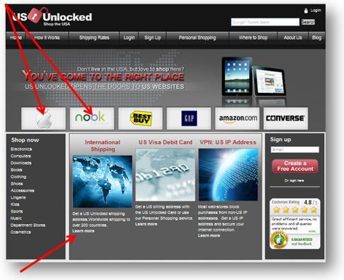
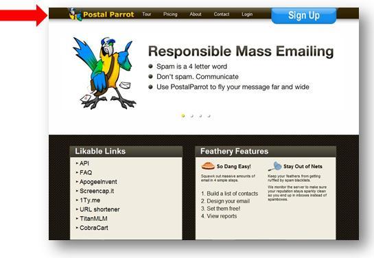
3. Visitors orient themselves on a page by looking at the top left corner. Like reading a book, we want to start at the top left. So make sure your logo and tag line appear in the top left, and right below that an eye-catching header.
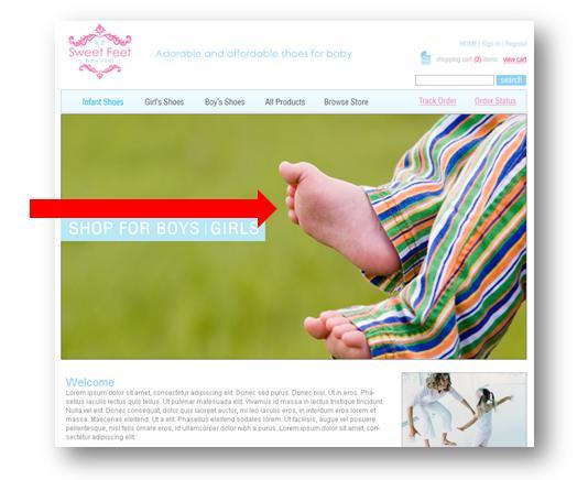
4. The Hero-shot can be used to draw attention to your call to action. A featured person on the homepage can be used to draw attention to a main element, such as a contact form. Visitors will instinctively look at whatever that person, the "hero shot", is looking at on the page. If you use a hero shot, be sure to consider carefully what that image is 'saying' to your visitor.

5. Foreshadowing information, and meeting
expectations, is important.
If you're using a PPC campaign, your landing page should match the ad title. A
website should also match the title meta tag and description tags, and interior
pages should match up with the link that goes to each page.

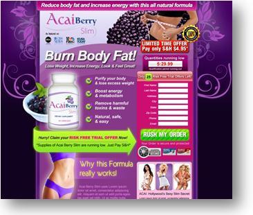
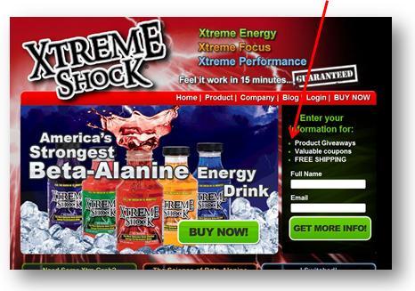
6. Focus on bulleted lists. Bulleted lists are easier to read and absorb information. Put important information in lists, such as benefits of your product, and it will be more likely to be read.

8. White space is good. People spend time "resting" by looking at white space. It relaxes a site visitor and also makes content easier to absorb by clearly spacing it out.
9. Choose font size carefully. Font influences how closely a user reads text. Smaller font means users will read text more closely, although this technique should be used sparingly and within reason. Font types and colors will also influence readability of text.
10. Use buttons and simple menus. People like to organize, so they spend time looking at buttons and menus. It is important to give visitors clear and obvious directions on where they should go. Want a free trial - click here. Want to contact us? Fill out this form. Buttons and good navigation simplify this and make your visitors happy.
