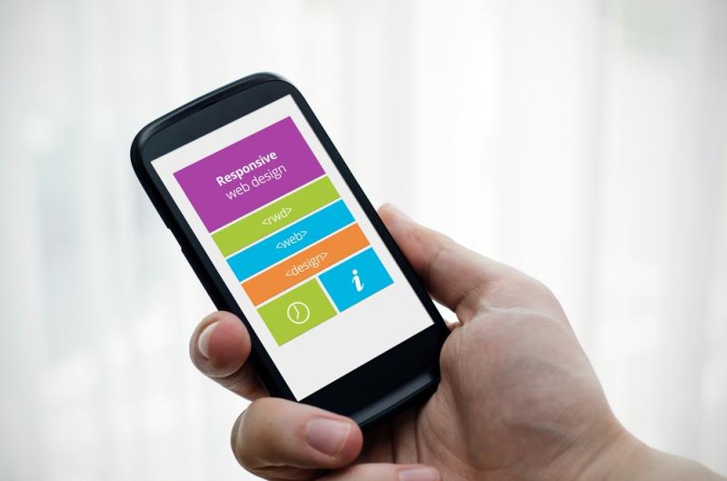
What does that mean for you? More than half of your emails are most likely being read from a mobile device. Make sure your emails are designed for these viewers to increase your click-through rates and keep your subscribers happy.
These are a few ways to design your emails with mobile in mind:
Use visuals.
Visuals catch the eye and can tell a story in a single glance. Use visuals to emphasize your point and make an emotional connection with the viewer without having to use too many words that might clutter up an email being viewed in a tiny screen.
Keep it short.
You should be able to sell your click in a few short sentences. Use simple motivators like fear of loss “the sale ends tomorrow”, appealing to their emotions “you can make a difference right now with a simple click”, or offering a reward “the first 100 subscribers will get $10 off.”
Have a clear call-to-action.
Make sure your readers know what they need to do, and make it easy to click on a mobile device. Buttons, large text, or plenty of white (empty) space are all ways to make sure your call-to-action is visible and easy to click.
Make sure the destination page is designed for mobile.
You’ve gotten your mobile readers to click, but is their destination mobile-friendly? Don’t send them to a page that is difficult to read on mobile. Most websites are now ready for mobile traffic, but not all mobile sites are created equal. Keep the same principles for mobile design in mind when designing the landing page your viewers are going to arrive at after clicking on your link / call to action.
This might seem easy, but the challenge is saying everything is small space, and getting your users to click within the first few moments of opening your email.
Do you have any tips to add? Questions? Share your thoughts in the comments.


