What should I include on my homepage?
I get asked this question a lot by business owners setting up their own websites.
What is a homepage?
This page on your website is where visitors will land when typing in your website address. For example, the ApogeeINVENT homepage is where you will “land” or what you see when you go to the website “apogeeinvent.com”.
Important Fact: The majority of people who visit your website will start on your homepage.
That is one reason why your homepage is so important.
It gives your website visitors their first impression of your business on the web. It helps them determine if they are in the right place. It should give them the information to decide what to do next.
Because your homepage needs to do all those things immediately, the design of your homepage is very important.
When I say design, I mean EVERYTHING that goes into a web page design. Layout. Colors. Font. Content Headlines. Images. Logo. Everything.
Visitors will form an impression in the first second. In fact, eye-tracking studies have found that website visitors make decision about your website within MILLISECONDS.
Let’s break down the things your homepage should include:
A Call to Action
A call to action, or CTA, is very important to help your visitors decide what to do next after they arrive on your homepage.
The kind of CTA you should use will depend on the goal of your website. For example, for our auto dealer clients, we often ask visitors to check out the dealership’s car inventory. Auto dealerships are hoping to find people looking to buy autos, and showing them popular car models they can ask about is a great first step.
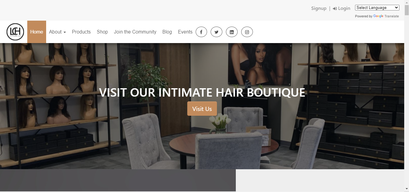
For our client Lili Clarke Hair, they invite customers to “Visit Us” and check out their hair boutique online.
What do you notice about these Call to Actions?
A great call to action should be succinct. Keep it short, but include power words: Free. You. Immediately. Now.
A great call to action should stand out.
Write Powerful Headers
You’d be surprised how many clients I talk with that don’t include headers.
The truth is, few people read your content. Everyone on the Internet is in a hurry. We want to consume vast amounts of information in a short time.
That means we skim.
And the first thing people will do is skim over your headers to find what they are looking for.
This is why creating bold, descriptive headers becomes so important.
When writing headers, especially for your homepage, pretend your website visitors will ONLY be reading the headers.
Headers should tell the whole story.
All other content should just add additional detail.
Our client Cannavative really takes this advice to heart. They use only headers on their homepage, with great results.
Well-Chosen Images
It is easy to just pick some stock photos and add them on your website. But not every image is going to improve your homepage.
Some images are just distractions. If you’re going to choose an image, make sure it enhances your message.
Some images can be used to “direct the eye.” What does this mean?
Eye-tracking studies found that if the image of a person is looking at something on your page, such as your Call to Action, website visitors are more likely to look at it.
Another tip when it comes to using images of people: Smiles are better.
Try to focus on positive emotions instead of negative ones. Focus on how people will be happier after they use your website.
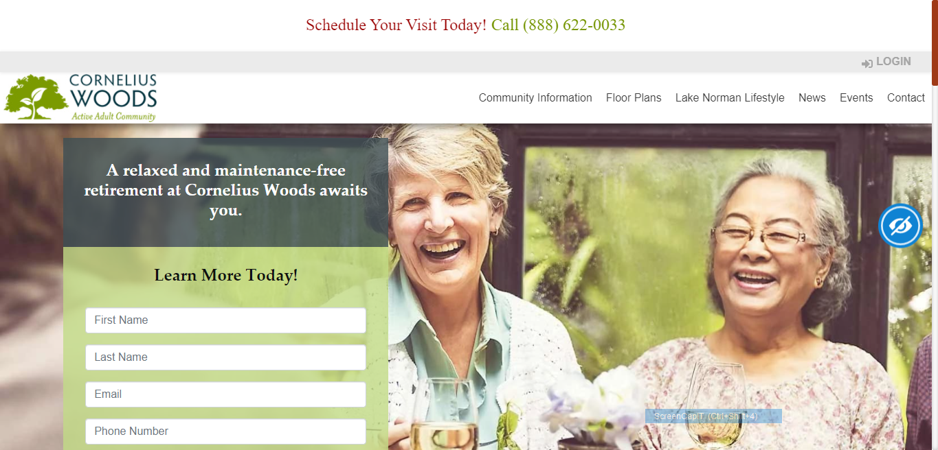
For example, we chose these people happily enjoying their retirement years as the header image for a retirement community. This conveys the sense of relaxation and socializing that could become a part of their life, if visitors schedule a visit and join the community.
Use Emotion
Using emotion, such as choosing images that include happy people, is important. Most people make decisions based on emotion. From CEOs to stay-at-home-moms, emotion is what makes us buy. Then we find facts to justify our emotional choices.
Mobile Responsive
Most website builders and products, like our ApogeeSITES, MarketingWEBSITE, and landing page products, are all built on a mobile framework. That means you won’t have to do much – they’ll automatically fit to the screen size of different devices.
If you have an older site that isn’t formatting properly on mobile, you need to update that immediately. Not sure if your website is mobile responsive? Just ask us. We’re happy to do a free check of your website.
Some of the things you can do to help your website be more mobile friendly include
checking your load speed. Load speed is crucial for both search engine optimization (getting Google to list your site in search results), and for user experience.
People visiting your website are more likely to make a purchase or contact you if your website loads quickly. Choosing the correct image size, limiting the widgets or plugins your site uses, and using a good hosting company are just a few of the ways to improve your load speed.
Another trend to keep in mind that make mobile browsing on your website more pleasant:
Horizontal and vertical scrolling.
Many sites are using both vertical scrolling (scrolling up and down) with horizontal scrolling (the ability to scroll side to side).
Our company
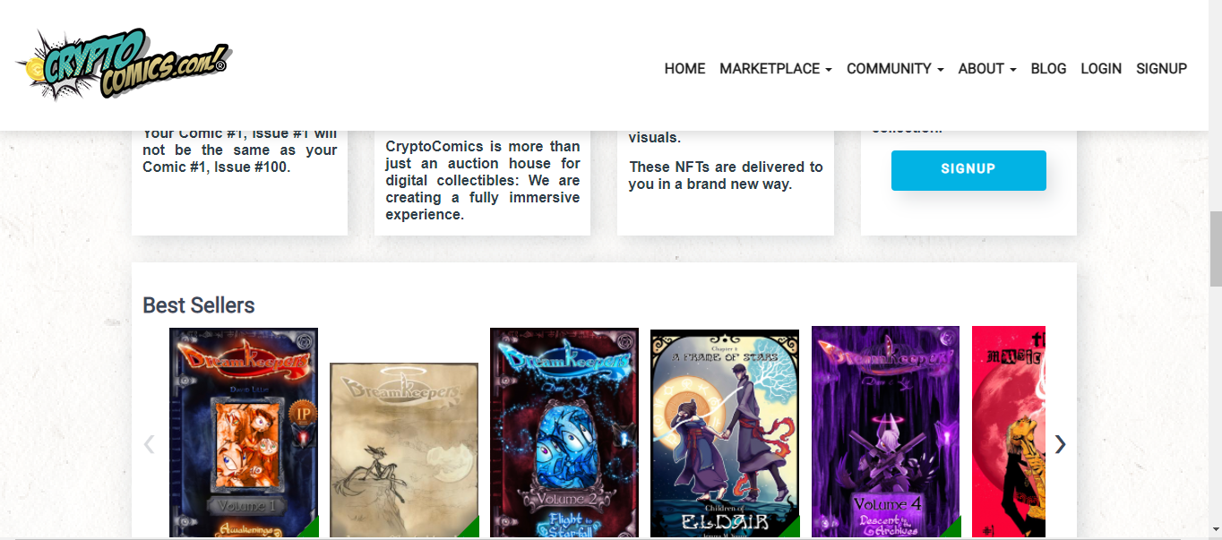
CryptoComics.com is a great example of how both types of scrolling are used to make it easier for people to see the information presented. Scrolling down, you can see the different topics / genres of books. Horizontal scrolling allows visitors to see more items in each category or genre, such as a longer list of blogs or more books in that genre.
Include Main Navigation Items
Your homepage should include all the main items in your navigation. This can help for mobile users, because it is easier to scroll down than to access the menu.
A carefully written header and a summary for each item will help users skim over your homepage to find what they’re looking for quickly.
Get an Exceptional Homepage Design from the Professionals!
If you’re new to website management or are a busy business owner, consider one of our many popular
website products.
We do all the design, set up, optimization, and hosting of your website. We have service packages that include full-service or concierge website management. We’ll do all the updating, image changes, and content updates for you!
We offer content packages as well. Our team has been creating content optimized for users AND search engine placement for over a decade, and many of our clients are listed on the first page of Google as a result.


