Graphic Design: Microsoft Logo and the Golden Ratio
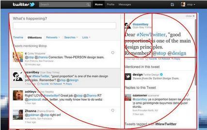
The golden ratio (1 to 1.618...) is a number derived from the Fibonacci Sequence (0, 1, 1, 2, 3, 5, 8, 13...) which is found in nature, especially in naturally occurring spirals.
So what's the big deal?
Some studies have shown that people looking at objects with golden ratio proportions find them more aesthetically pleasing - even when they have never heard of the golden ratio before.
So, when I heard today that Microsoft had redesigned their logo for the first time in 25 years, I immediately busted out my ruler and calculator. Low and behold the ratio between the height of the redesigned icon and the height of "Microsoft" are approximately 1 to 1.6.So the next time you have to decide on the size of 2 objects, or the dimensions of a rectangle, why not use the golden ratio? You just might find your audience a bit more aesthetically pleased, and even if they aren't, you'll be in good company.


