What we thought:
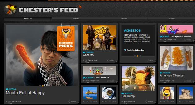
- Logo: great logo bevel & gradient.
- Style: nice header background texture, icons turn from 2D to 3D, which is quite eye catching.
- Animation: flipping animation in top left is super nice and based in HTML5, not flash.
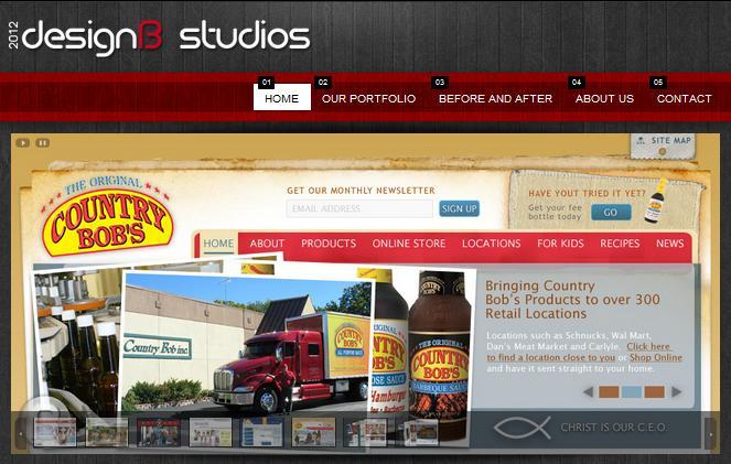
- Colors: nice wood texture with modern red/gray colors, radial gradient, top light source.
- Style: slideshow is convoluted. the bottom of site feels unfinished, lacks a call-to-action.
- Font: Doesn't entice reading due to lack of iconography and small text size.
Site Reviewed: Truf Creative
What we thought:
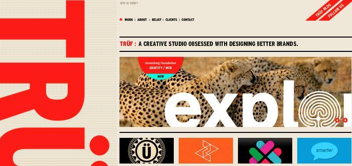
- A real designer's type of design, reminiscent of a font magazine.
- Color choice: nice tan/red color combo.
- Style: distressed look works well, retro / mod style is ultra chic.
- Font: highly custom fonts.


