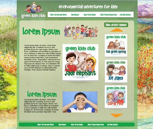
Combining beauty with functionality is a constant challenge for our web design team. We wanted to give you a little peek into our efforts in reviewing our own designs to create the perfect mix.
All of our design packages include our Design Till You Love It guarantee. We won't stop designing until our client loves the results - at no extra cost. Green Kids Club Internal Design Review:
Background
- We need to use the client's artwork, but it is pretty busy and distracting. Perhaps there is a way for us to mute it out a little bit or add a slight color overlay that makes it less bold.
- Since this is a layered page type of design I think it warrants using some subtle textures to break the plain color backgrounds. A construction paper texture would work well:
Shadows
- There are too many different styles of shadows (and lack thereof) in use.
- Need to standardize shadow styles and apply to all elements meant to be floating above background.
- Mmay want to also add shadow to side edges of main content area so that it floats above the illustrated background. This shadow may be an irregular shadow so that it appears the content area is curling up like a paper:
Text
- I would like to see more fine details in the text effects.
- If there is a top lighting source as the shadows indicates I think it would look nice to have a white light effect on the bottom edge of the larger text elements:
- Alternatively you can add some subtle shadows to give the overlay effect rather than the punched out effect:
Navigation
- Try giving long horizontal navigation bars a subtle gradient to indicate top light source on a 3D object:
Buttons
- The buttons would feel more clickable if they were made 3D using a gradient and edge bevels:


