Every weekday we review website and brand designs with our design crew. Good or bad, we pick them apart in an effort to continually evolve our own understanding of what makes a website beautiful AND effective. Here are a few designs we reviewed today!
Your Membershiphttp://www.yourmembership.com/
- sections look like they are Frankensteined together
- theme not cohesive
- too many fonts on the site including serif and sans-serif
- Tim Ash says infinite slideshows are a no-no, and Tim Ash rules!
- small white text on dark blue background is difficult to read
- nothing in the footer is aligned with anything else
- no single call-to-action; what's the one thing you want us to do next?
VCita
http://www.vcita.com/
- good call to action button
- - includes the word "Free"
- - big green button
- call to action button color gets lots in sea of colors however
- nice text treatment throughout site
- - good use of bevels and shadows to create letterpress effect
- colored branding of features is a nice touch
- feature explanations are barely bigger than their icons; shouldn't they be much larger?
- blurred background makes stock photo guy stand out like a professional focused photo
- shadows, reflections, and textures are consistent and elegant
- mega footer section does a good job of presenting the sitemap
- great testimonials rotator
- web professional program seal extends out of container div which looks fantastic
- grayed out recognizable logos are nice, but are they clients, integrated 3rd party tools, or partners?
- social media icons are not consistently sized or presented in bottom right
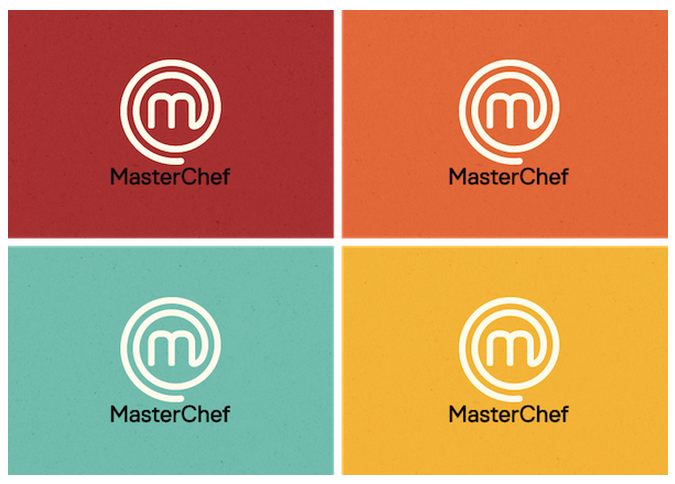
Master Chef Logo
- changes are super subtle
- apparently they changed colors, textures, and text size / kerning
- logo shape was not immediately recognizable as a stove top burner, but once noticed it was found to be kinda clever
- "m" mark looks a lot like an @ symbol which was confusing
- overall the "m" mark can be a good recognizable icon used apart from the MasterChef text once the brand grows to a certain size
- nice textures, shadows, and bevels give the logo subtle and realistic depth
