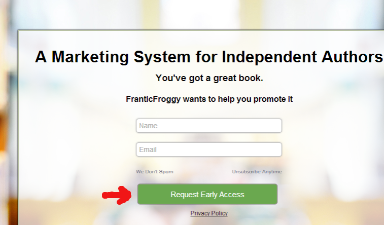
That doesn't sound very polite, does it? We've been taught to suggest, to ask nicely, but to tell others what to do? If you do it right, you can tell your web visitors what to do (politely and subtly) and they will gladly do it.
How?
Web users (about 80% of North America) have millions of pages on thousands of different subjects to peruse. They are usually in a hurry, browsing during lunch or a commute, while working or watching TV. There are so many things pulling at their attention. Make their life easier by TELLING THEM WHAT TO DO on your website. It saves them time, and it makes your marketing more successful. Win / win situation for everyone.
3 Ways to Tell Your Website Visitors What to Do:
Use the power of images to direct web visitors around your page.
Humans have a natural tendency to follow the gaze of others. One study, called Eye Gaze Cannot be Ignored, showed a definite tendency for people to follow the gaze of others. Take a look at these eye-tracking heat maps.
Babies and attractive women’s faces garner the most attention (shocking, I know). The baby in this image is getting the most attention of web visitors. But it can be distracting users from the headline, which is the important marketing message.
Now look at this image. The baby’s gaze is directed at the text. You can tell from the browsing pattern that by turning the baby’s gaze to the text made a big difference in increasing the amount of text that the visitors viewed.
Tell visitors where to look by using an image that looks at the important part of your page. Arrows are another effective way to direct users’ attention. Hands pointing, even funnel shaped designs can all direct users where to go on your page to perform the ‘call to action’.
Tell your visitors what to do in your call to action text.
The call to action is how you tell you visitors what you want them to do once they 'land on' or come to your page.
Call now. Click here. Fill out this form. Sign up.
Clearly and succinctly tell your web visitors what to do. Visitors are on your page for a reason – to learn more about your business or products, to buy your products, or to read useful or interesting content you posted. Using text that directs them in the appropriate direction will make their life easier and make them more likely to perform the action you want them to.
Don't let visitors get lost on your homepage. Tell them the action you want them to take next.
Encourage visitors / customers to share their opinions.
Soliciting recommendations, reviews, and comments is important. Other visitors / potential customers will be more likely to take an action if they see more interaction. This applies to both your web page and any social media profiles you manage.
In your blog, be sure to include a section that asks for comments. “Tell us what you think! Share your opinion!”
Don’t be afraid to ask for recommendations or reviews of your business or products. “Like our company? Write a review!” “Share this product on Facebook!” One positive comment, or a negative comment that you have addressed publicly, can make the difference between a visitor becoming a customer.
Good reviews are some of the best marketing. 86% of people have been influenced by family and close friends’ recommendations to make a purchase. It is difficult to know who to trust online when it comes to making a decision to buy. We are most likely to take the advice of someone we know when it comes to making a purchase. Solicit recommendations from your fans and followers to build trust from new customers.
Let others tell your visitors what to do through their recommendations, testimonials, and ratings. By including social media sharing icons on your pages, you can make it easy for visitors to share your product and tell their friends what to do: Buy from you!
Do you know other ways to tell web users what to do? Is it a good idea? A bad one? Tell us what you think in the comments below.
 By Lindsey Winsemius. Lindsey is the Vice President of Communications for ApogeeINVENT, and is the social media voice and blogger for the company. Follow her on Twitter or connect with her on LinkedIn or Google+

 By Lindsey Winsemius. Lindsey is the Vice President of Communications for ApogeeINVENT, and is the social media voice and blogger for the company. Follow her on Twitter or connect with her on LinkedIn or Google+